Welcome, Ines!
This is your complete guide to updating inesrivero.com.
Use the search bar to find what you need, or browse the sections on the left.
Getting Started
- Open your web browser (Safari, Chrome, or any browser).
- In the address bar, go to admin.shopify.com/store/ines-rivero and press Enter.
- Enter your email address and password.
- Click "Log in."
- You will see the Shopify admin dashboard — this is your control center.
On the left side, there is a menu. The two areas you will use most are:
- Online Store — this is where your website theme and design lives. You will use this to open the Theme Editor.
- Content — this expands to show Metaobjects, Files, Menus, and Blog posts. You will use Menus to update navigation and Blog posts to add new articles.
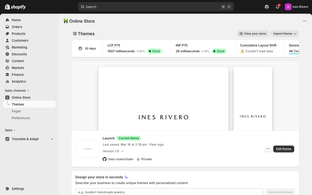
- In the left menu, click "Online Store," then "Themes." Or go directly to admin.shopify.com/store/ines-rivero/themes.
- You will see your current theme. Click the green "Edit theme" button.
- This opens the Theme Editor — this is where you will make most changes to your site.
When you are done making changes, click the green "Save" button in the top-right corner. The Save button appears greyed out when no changes have been made — it turns green once you change something.
To preview your changes without saving, click the eye icon.
If you want to undo your changes, simply do not click Save — your live site stays unchanged.
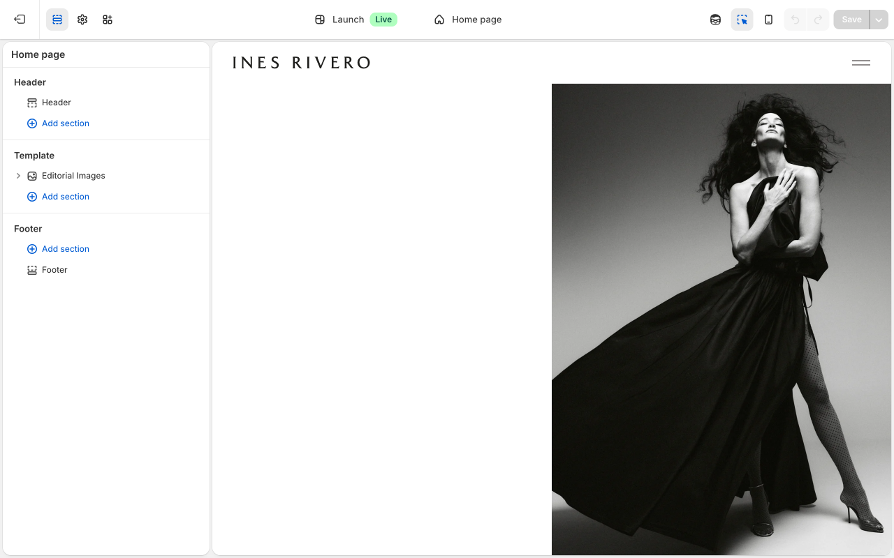
Your website is made up of "sections" — think of them as the big building blocks of each page.
Inside sections, there are "blocks" — smaller pieces like individual images or text areas.
You can add, remove, and rearrange blocks within a section.
In the Theme Editor, you will see these listed in the left sidebar panel.
Your Pages
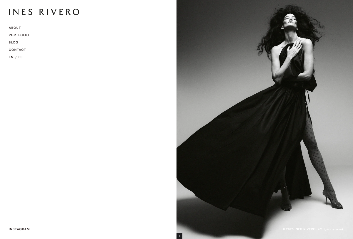
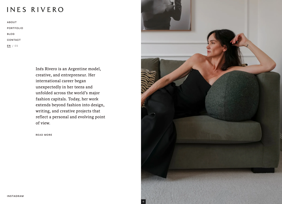
Your homepage shows one large editorial image with a caption. It is the first thing visitors see.
How to get there
- Open the Theme Editor (Online Store → Themes → Edit theme).
- Click the page dropdown in the top center of the toolbar — it will say something like "Home page" — and select "Home page."
You will see one section called "Editorial Images" with one image block inside it. Click the block in the left sidebar to see its settings.
Image block settings
Image: Click the image thumbnail to change the photo. You can upload a new image or choose from your library.
Image alt text: A short description of the image for people who cannot see it (accessibility). For example: "Ines Rivero wearing a white gown."
Image position: Choose whether the image appears on the left or right side of the page.
Aspect ratio: "Full screen" makes the image fill the entire space. "Natural" shows the image at its original proportions. The other options (Square, Portrait, Landscape) crop the image to a fixed shape.
Inset image: When turned on, adds padding around the image so it sits inside a white border rather than edge-to-edge.
Full screen container: When turned on, the image column locks to the full screen height with the image centered inside it.
Subtract header height on mobile: When turned on, reduces the image height by 60px on mobile so the full image fits on screen without being cut off by the header.
Mobile order: Controls whether the image or text appears first when someone views the page on their phone.
Mobile image height: Controls how tall the image is on mobile. "Full viewport (min 100svh)" is the default full-screen look. You can also choose a percentage (e.g., 75vh) or "Auto" to shrink it.
Mobile text height: Controls how tall the text column is on mobile. "Default" uses full screen height. You can choose a percentage to make it shorter.
Text max width: How wide the text column can be (in pixels). Set to 0 to use the default (416px).
Text content: Any text you want displayed next to the image. You can use bold, italic, and links.
CTA text: The text for the link button (e.g., "Read More"). Leave blank if you do not want a button.
CTA link: Where the button links to. Can be a page on your site or an external URL.
Header color scheme: Usually set to "Auto." If the header text is hard to read against the image, switch to "Dark image (light header)" for dark photos or "Light image (dark header)" for light photos.
Anchor ID: A bookmark name for this block (e.g., "about"). Other buttons can link to "#about" to scroll directly to this block. Leave blank if you do not need this.
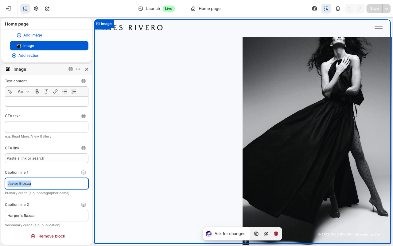
Caption line 1: First line of the small image credit (e.g., photographer name). Visible when hovering the corner of the image.
Caption line 2: Second line of the image credit (e.g., publication name).
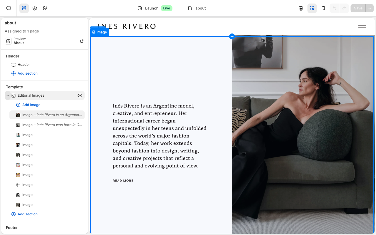
Your About page tells your story through a series of editorial images with text. It is your most detailed page.
How to get there
- Open the Theme Editor (Online Store → Themes → Edit theme).
- Click the page dropdown and select "About."
You will see one section called "Editorial Images" with 10 image blocks inside it. Each block is one row on the page — an image paired with optional text. Click any block in the left sidebar to edit its settings.
Each image block has these settings
Image: Click the image thumbnail to change the photo. You can upload a new image or choose from your library.
Image alt text: A short description of the image for accessibility (e.g., "Ines Rivero on runway, Paris 2023"). Falls back to the image's own alt text if left blank.
Text content: The text that appears next to the image. Click into the text area to edit. You can make text bold, italic, or add links using the toolbar above the text box.
CTA text: The text for the link button (e.g., "Read More"). Leave blank if you do not want a button.
CTA link: Where the button links to. For example, "#about" scrolls down to the block with anchor ID "about" on the same page.
Image position: Left or right — controls which side the image appears on.
Text alignment: Controls whether the text beside the image is vertically centered or aligned to the top.
Image alignment: Controls whether the image itself is vertically centered or aligned to the top within its column.
Aspect ratio: "Full screen" makes the image fill the column height. "Natural" shows the image at its original proportions. You can also choose Square, Portrait, or Landscape.
Inset image: When turned on, adds padding around the image so it sits inside a white border rather than edge-to-edge.
Full screen container: When turned on, the image column locks to the full screen height with the image centered inside.
Subtract header height on mobile: When turned on, reduces image height by 60px on mobile so the image fits above the fold without being hidden behind the header.
Mobile order: Controls whether the image or text appears first when someone views the page on their phone. Default is image first.
Mobile image height: Controls how tall the image is on mobile. "Full viewport (min 100svh)" is the default. You can choose a percentage or "Auto."
Mobile text height: Controls how tall the text column is on mobile. "Default" uses full screen height. You can choose a percentage to make it shorter.
Text max width: The maximum width of the text column in pixels. Set to 0 to use the default (416px).
Header color scheme: Usually set to "Auto" which works perfectly. If the header text is hard to read against a dark photo, switch to "Dark image (light header)." For light photos where the header is hard to see, use "Light image (dark header)."
Anchor ID: A bookmark name for this block. For example, setting this to "about" lets other buttons link to "#about" to scroll directly to this row. Leave blank if you do not need this.
Caption line 1: First line of the small image credit (e.g., photographer name). Visible when hovering the corner of the image.
Caption line 2: Second line of the image credit (e.g., publication name).
The other 9 blocks work exactly the same way. Scroll down in the editor sidebar to find each one.
To rearrange the order of image blocks, grab the six-dot drag handle next to any block in the sidebar and drag it up or down.
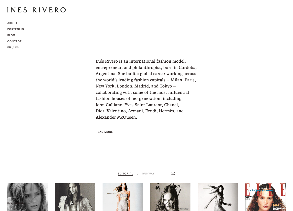
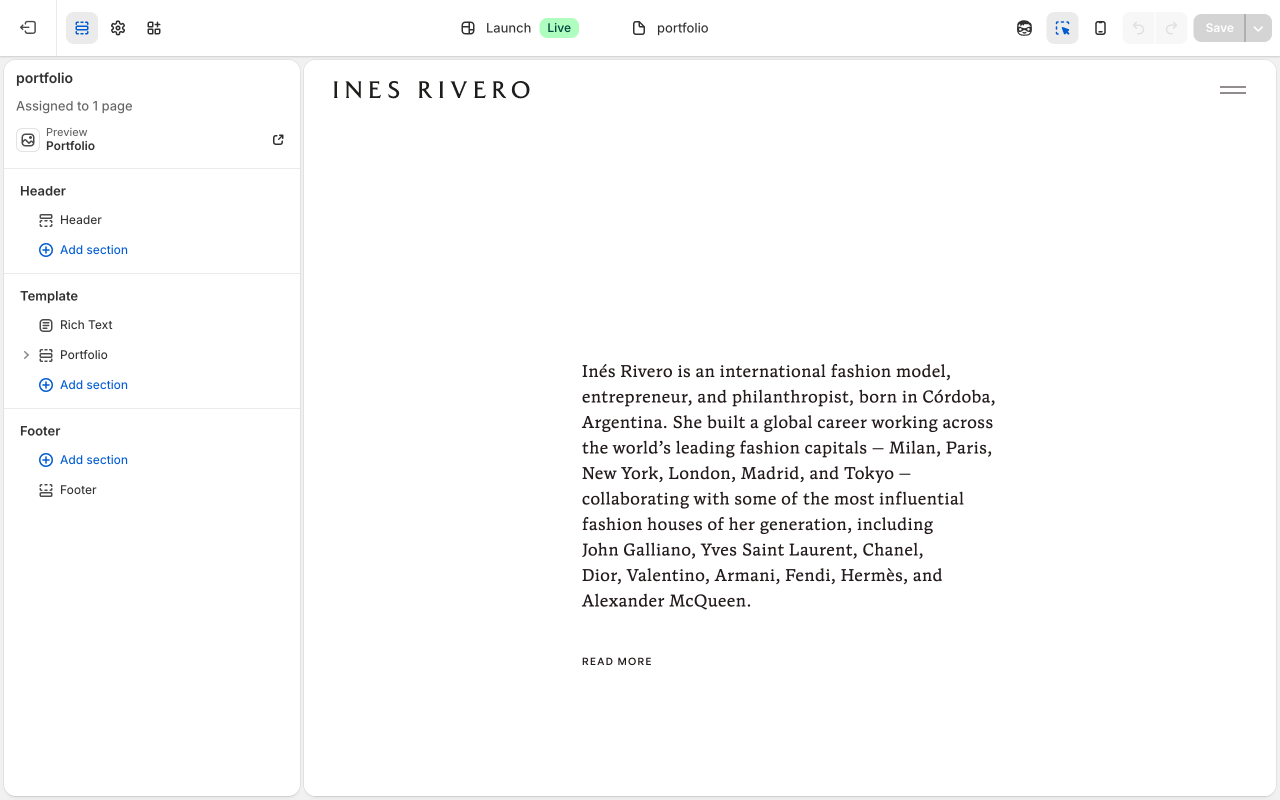
Your Portfolio page has two parts: an introduction text at the top, and the portfolio image grid below.
How to get there
- Open the Theme Editor (Online Store → Themes → Edit theme).
- Click the page dropdown and select "Portfolio."
- You will see two sections in the left sidebar: "Rich Text" (the intro text) and "Portfolio" (the image grid).
Rich Text section settings
Visible text: Your main introduction paragraph that visitors always see when they arrive on the page.
Expanded text: Additional text hidden by default — revealed when someone clicks the "Read More" button. Leave this blank if you want a CTA link button instead.
CTA text: The label for the link button (e.g., "View Portfolio"). Only appears if "Expanded text" is empty.
CTA link: Where the button links to. Only used if "Expanded text" is empty.
Text max width: The maximum width of the text column in pixels. Default is 416px.
Top padding: The space above the text, in pixels. Default is 240px. Reduce this to move the text higher on the page.
Minimum height: How tall the section is at minimum. "Full viewport (100svh)" makes it fill the whole screen. Set to "Auto" if you want the section to only be as tall as its content.
Header color scheme: Controls the header text color for this section. Usually leave on "Auto."
Vertical alignment: "Center" positions the text in the middle of the section. "Top" anchors it to the top.
Portfolio section settings
Grid aspect ratio: Controls the shape of every thumbnail in the grid. Options are: 3:4 Portrait (default), 4:5 Portrait, 2:3 Portrait, 1:1 Square, 4:3 Landscape. Note: when you click a photo to open it in the lightbox, it always shows the full natural size of the image regardless of this setting.
Portfolio Category block settings
Label: The tab name visitors see at the top of the page (e.g., "Runway" or "Editorial").
Header color scheme: Controls the header text color when the portfolio grid is on screen. Usually leave this on "Auto." Change it if the header text is hard to read against the grid background.
Portfolio Item block settings
Image: The photo that appears in the grid. Click to upload or choose from your library.
Video URL: Optional. If you paste a video link here, clicking the thumbnail will open the video in the lightbox instead of the photo.
Caption line 1: First line of the image credit shown in the lightbox (e.g., photographer name).
Caption line 2: Second line of the image credit (e.g., publication name).
To add a new photo to an existing category:
- In the Theme Editor, open the Portfolio page.
- Find the category in the left sidebar (e.g., "Editorial").
- Click "Add block" inside that category.
- Select "Portfolio Item."
- Click the "Image" field to upload your photo or choose from your library.
- Optionally add caption credits.
- Click Save.
To add a new category:
- In the Theme Editor, open the Portfolio page.
- Click "Add block" at the "Portfolio" section level (not inside an existing category).
- Select "Portfolio Category."
- Type the name in the "Label" field — this becomes the tab visitors click.
- Then add Portfolio Items inside this new category.
- Click Save.
To reorder photos or categories, drag them up or down using the six-dot handle in the sidebar.
To remove a photo, click it in the sidebar, scroll to the very bottom of its settings panel, and click "Remove block." Then click Save.
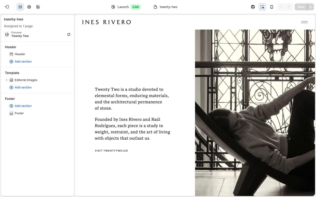
This page features your TwentyTwo studio with a single editorial image and a link to twentytwo.co.
How to get there
- Open the Theme Editor (Online Store → Themes → Edit theme).
- Click the page dropdown and select "TwentyTwo."
It works exactly like the Homepage — one "Editorial Images" section with one image block. Click the block in the left sidebar to see its settings.
Key fields
Image: Click the image thumbnail to change the photo.
Text content: The studio description.
CTA text: The label on the link button (e.g., "Visit TwentyTwo"). Leave blank if you do not want a button.
CTA link: The web address the button goes to. To update the link to the TwentyTwo website, change this field.
Caption line 1: First line of the image credit shown near the image (e.g., photographer name).
Caption line 2: Second line of the image credit (e.g., publication name).
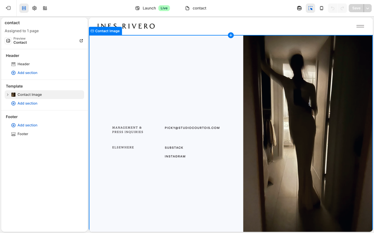
Your Contact page shows an image alongside your contact information.
How to get there
- Open the Theme Editor (Online Store → Themes → Edit theme).
- Click the page dropdown and select "Contact."
You will see one section called "Contact Image." Click on it in the left sidebar to see the image settings. Your contact rows (Management, Press Inquiries, Elsewhere) are blocks inside this section.
Section image settings
Image: The large photo that fills the right half of the page. Click to upload or choose from your library.
Image alt text: A short description of the image for accessibility.
Image position: Choose whether the image is on the left or right side of the page.
Aspect ratio: "Full screen" makes the image fill the column height. Other options crop the image to a specific shape.
Full screen container: When turned on, locks the image column to the full screen height.
Subtract header height on mobile: When turned on, reduces height by 60px on mobile so the content fits above the fold.
Lock image to full viewport on mobile: Forces the image column to exactly full screen height on mobile.
Mobile order: Controls whether the contact info or the image appears first on mobile. Default is contact info first.
Header color scheme: Controls header text color when overlapping this section. Leave on "Auto" unless the header is hard to read.
Caption line 1: First line of the image credit (e.g., photographer name). Visible when hovering the corner of the image.
Caption line 2: Second line of the image credit (e.g., publication name).
Contact Row block settings
Each contact category (Management, Press Inquiries, Elsewhere) is a "Contact Row" block.
Label: The category heading visitors see (e.g., "Management" or "Elsewhere").
Contact Link block settings
Each individual link inside a row (an email or social link) is a "Contact Link" block.
Text: The text visitors see and click (e.g., "picky@studiocourtois.com" or "Instagram").
URL: The full web address the link goes to (e.g., "mailto:picky@studiocourtois.com" for emails, or "https://instagram.com/inesrivero" for social links).
Open in new tab: When turned on, the link opens in a new browser tab instead of replacing the current page. Recommended for external links like Instagram.
To change an email or link:
- In the Theme Editor, open the Contact page.
- Find the Contact Row in the left sidebar (e.g., "Management").
- Click the Contact Link you want to change (e.g., the email address).
- Update the "Text" field (what visitors see) and/or the "URL" field (where it goes).
- Click Save.
To add a new link inside an existing row:
- In the Theme Editor, open the Contact page.
- Find the Contact Row in the sidebar (e.g., "Elsewhere").
- Click "Add block" inside that row.
- Select "Contact Link."
- Fill in the "Text" (the visible label), the "URL" (the address), and whether it should open in a new tab.
- Click Save.
To add a new contact category:
- In the Theme Editor, open the Contact page.
- Click "Add block" at the "Contact Image" section level (not inside an existing row).
- Select "Contact Row."
- Type a name in the "Label" field.
- Then add Contact Link blocks inside this new row.
- Click Save.
Your blog has two parts: the blog listing page (shows all your posts) and each individual article page (see next section). This section covers both how to add new posts and how to change the listing page design.
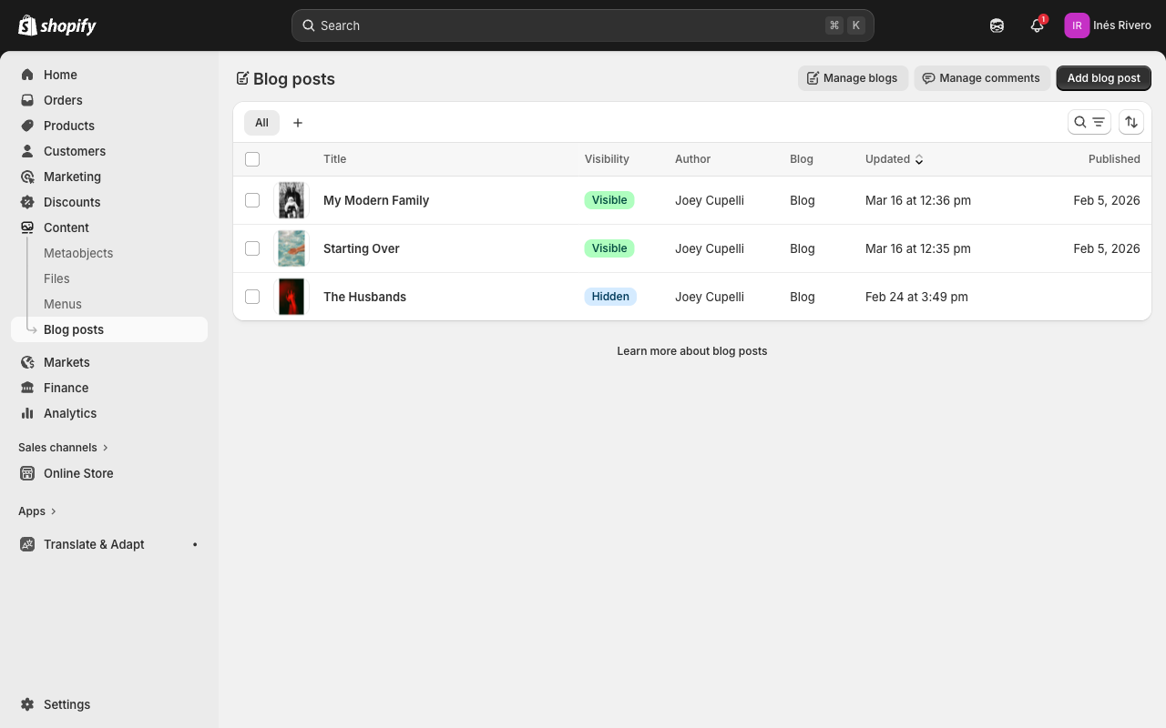
How to add a new blog post
- Go to Content → Blog posts in the Shopify admin.
- Click the green "Add blog post" button in the top-right corner.
- Type your title at the top.
- Write your content in the large text area below.
- On the right side, click "Upload image" to add a featured image (this is the photo that appears on the blog listing).
- Under "Organization," make sure the Blog is set to "ines" (your blog name).
- To publish immediately: change the "Visibility" dropdown from "Hidden" to "Visible," then click Save.
- To save as a draft (not visible to visitors): leave visibility as "Hidden" and click Save. You can publish later.
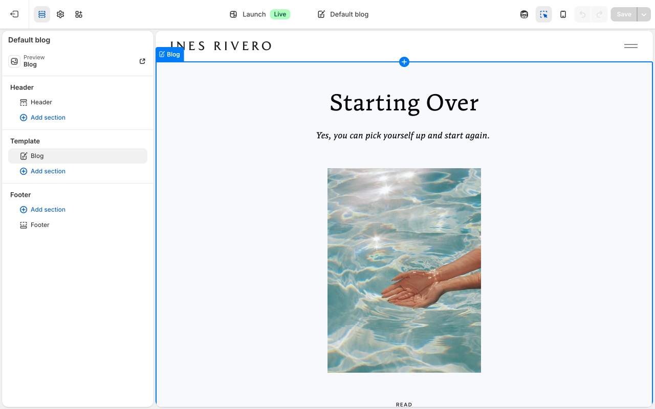
How to change the blog listing page design
- Open the Theme Editor (Online Store → Themes → Edit theme).
- Click the page dropdown at the top center and select "Blog."
- Click the "Blog" section in the left sidebar to see its settings.
Articles per page: How many posts appear on the blog page before you need to click to the next page. Default is 6.
Image aspect ratio: The shape of the article thumbnail images. Options include Portrait (3:4 is the default), Square, and Landscape.
Button text: The label on the button below each article. Default is "Read."
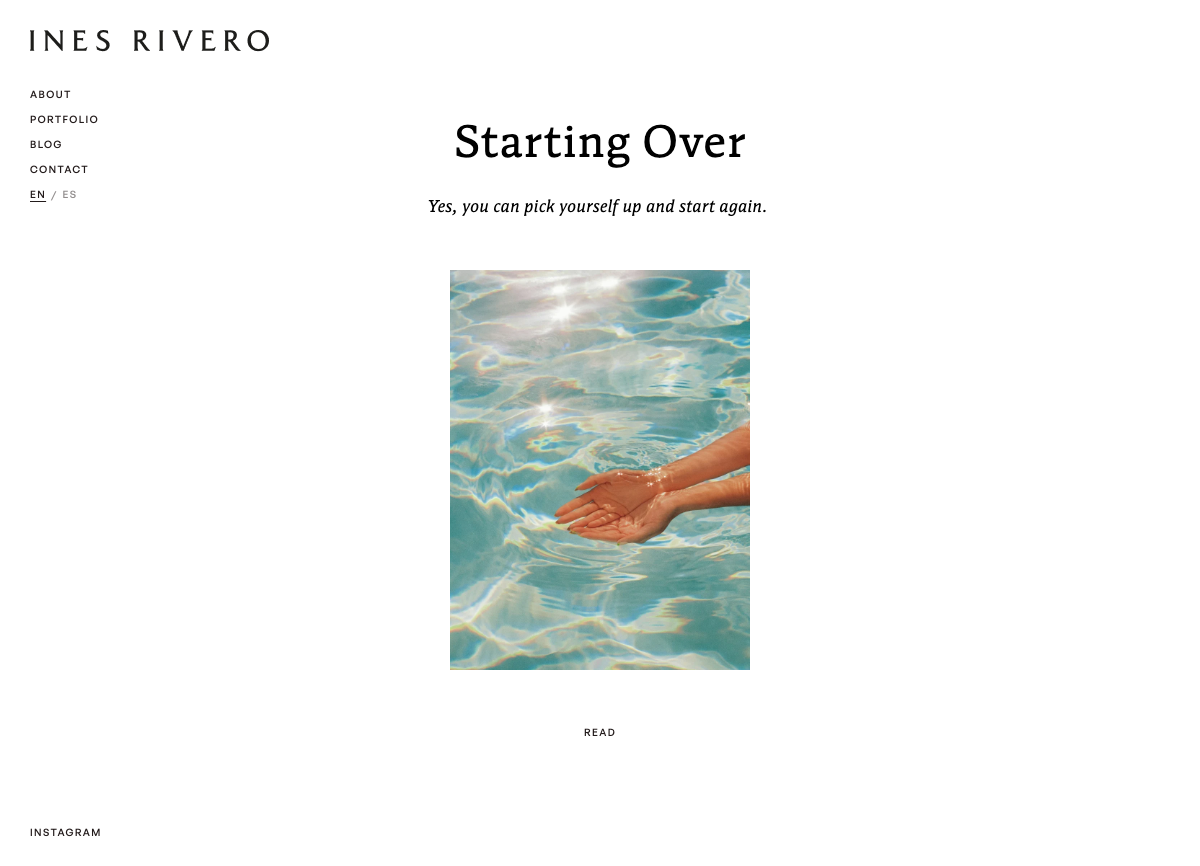
This is the layout for each individual blog post — what visitors see when they click into an article. It shows a hero image, the title, the article body, a link to Substack (if set), and a row of "More stories" at the bottom.
How to get there (Theme Editor)
- Open the Theme Editor (Online Store → Themes → Edit theme).
- Click the page dropdown at the top center and select one of your blog articles (you may need to scroll down, or look under "Blog posts").
- Click the article section in the left sidebar to see its settings.
Article section settings
Hero header color scheme: Controls the header text color when it overlaps the hero image. Set to "Auto" by default. Switch to "Dark image (light header)" if the header text is hard to read against a dark photo.
Substack headline: The large italic text shown above the Substack button. Default is "Continue reading on Substack." Change this if you want different wording.
Substack button text: The text on the small call-to-action button below the Substack headline. Default is "Read More."
More stories headline: The heading above the row of related articles at the bottom of every post. Default is "More stories."
How to set the Substack link for an article
The Substack section only appears on an article if you add a Substack URL to that specific post's metafield. Here is how:
- Go to Content → Blog posts in the Shopify admin.
- Click the article you want to update.
- Scroll down to the "Metafields" section near the bottom of the page.
- Find the "Substack URL" field and paste the full link to the Substack post (e.g., https://inesrivero.substack.com/p/your-article).
- Click Save.
If the Substack URL field is blank, the article body will show in full on your site instead.
Common Tasks
- Open the Theme Editor (Online Store → Themes → Edit theme).
- Select the page with the image from the dropdown at the top.
- Click the image block in the left sidebar.
- Click the image thumbnail in the settings panel.
- Click "Upload" to add a new image, or choose one from your library.
- Click Save (green button, top-right).
- Open the Theme Editor.
- Select the page from the dropdown.
- Click the block that contains the text in the left sidebar.
- Click into the text area and make your changes.
- Use the toolbar above for bold, italic, or links.
- Click Save.
- Open the Theme Editor.
- Select the page from the dropdown.
- Find the section where you want to add content.
- Click "Add block" (appears when you hover over the section).
- Choose the type of block (Image, Contact Row, Portfolio Item, etc.).
- Fill in the settings.
- Click Save.
- Open the Theme Editor.
- Select the page from the dropdown.
- Click the block you want to remove in the left sidebar.
- Scroll to the very bottom of the settings panel.
- Click "Remove block."
- Click Save.
- Open the Theme Editor.
- Select the page from the dropdown.
- In the left sidebar, find the block you want to move.
- Click and hold the six-dot drag handle next to it.
- Drag it up or down to the new position.
- Release and click Save.
- Open the Theme Editor.
- Find the block with the link (e.g., a CTA button or Contact Link).
- Change the link field (e.g., "CTA link") to the new web address.
- Click Save.
- Go to Content → Blog posts in the Shopify admin.
- Click "Add blog post."
- Add title, content, and featured image.
- Set visibility to "Visible" to publish.
- Click Save.
- Go to Content → Menus in the Shopify admin.
- Click the menu you want to edit (e.g., "Header (Main)").
- To add a link: click "Add menu item," enter a name and URL.
- To remove: click the X next to the item.
- To reorder: drag items up or down.
- Click Save.
Navigation & Footer
Your site has a sidebar navigation on the left on desktop, and a hamburger menu on mobile. The header has two settings you can configure in the Theme Editor:
How to get there
- Open the Theme Editor (Online Store → Themes → Edit theme).
- In the left sidebar, look at the very top for the "Header" section (it may be inside a section group). Click on it.
Header section settings
Menu: The main navigation links (About, Portfolio, TwentyTwo, etc.) shown in the sidebar. This connects to a menu in Content → Menus. The menu is currently named "Header (Main)."
Footer menu: The smaller links at the very bottom of the sidebar (Contact, Blog, etc.). This connects to a separate menu in Content → Menus. The menu is currently named "Header (Footer)."
To add or change navigation links
- Go to Content → Menus in the Shopify admin.
- Click "Header (Main)" to edit the main navigation, or "Header (Footer)" to edit the footer links.
- To add a link: click "Add menu item," type a name, and paste or select the URL.
- To remove: click the X next to the item.
- To reorder: drag items up or down.
- Click Save menu.
To update the logo
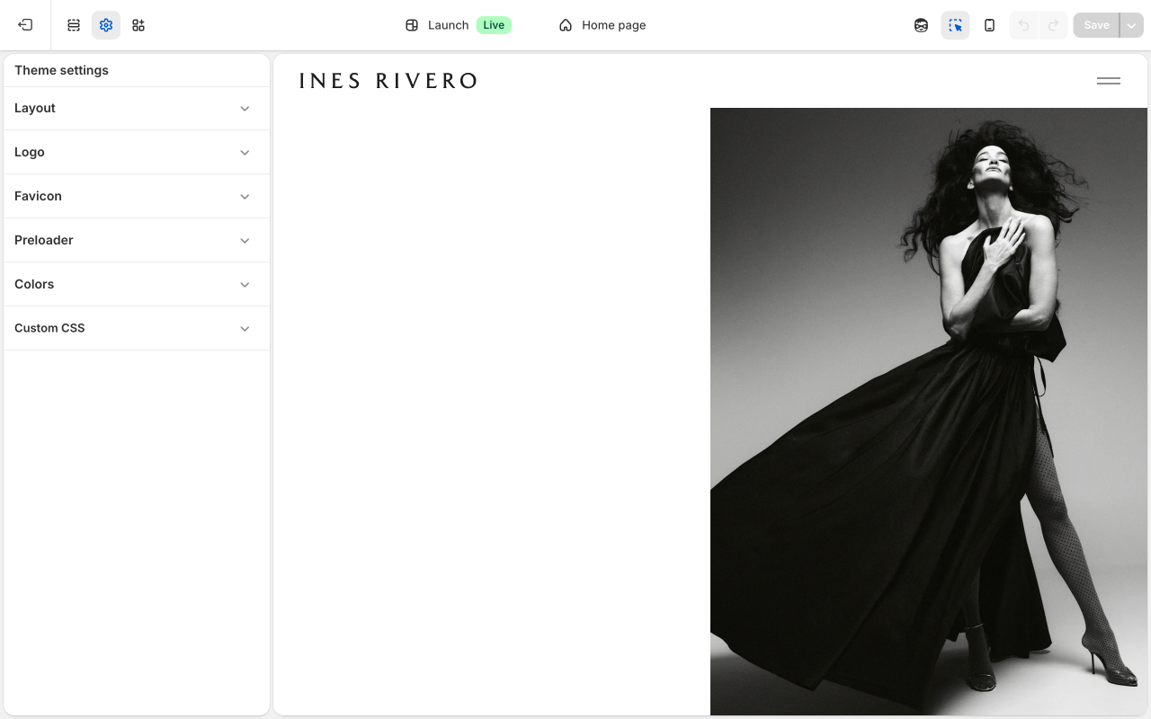
The logo is managed in Theme Settings (not the Header section):
- In the Theme Editor, click the gear/settings icon in the top-left toolbar to open "Theme settings."
- Click "Logo."
- Upload your dark version (used on light backgrounds) and light version (used on dark backgrounds).
- Click Save.
The footer appears at the bottom of every page. It shows a copyright line.
How to get there
- Open the Theme Editor (Online Store → Themes → Edit theme).
- In the left sidebar, scroll to the very bottom and click the "Footer" section.
Footer settings
Copyright text: The name that appears after the © symbol and year. Default is "INES RIVERO."
Copyright suffix: The italic text that appears after the copyright name. Default is "All rights reserved."
Overlay on pages: A comma-separated list of page template names where the footer should float over the page content (e.g., index, page.about). Leave blank to not use this. This is a developer setting you will likely not need to change.
Overlay text color: The color of the copyright text when the footer is in overlay mode. Default is white (#ffffff).
Disable overlay on mobile: When turned on, the footer returns to its normal position on mobile even if overlay mode is active on desktop.
Mobile text color: Overrides the text color on mobile only. Default is dark (#231b1b).